One of the to-do tasks that keeps getting shoved lower on my priority list is to provide genealogy software developers with a list of what we need to incorporate DNA data into our databases and to create useful output for analysis. Genetic genealogical research has matured to the point where this should become a priority.
If we all pool our ideas, we can come up with a good list to provide to developers so the output is what we want. We need a list of the data we want to store in the genealogy database as well as what type of output reports we need.
So what would your ideal genealogy database incorporate and provide as output for your genetic analysis? Not necessarily the raw DNA data for analysis, but the shared DNA data related to the other test-takers in your database.
Feel free to provide suggestions as comments to this blog post, as Facebook comments if you read this on Facebook, or contact me directly using the email addresses on my website http://debbiewayne.com/ (scroll to the bottom of any page to see contact info).
So what finally spurred me to make this a priority after all this time? (1) I investigated different tree creation tools a few months ago and discussed it on Facebook. I found none of the tools produce exactly what I want for DNA analysis. (2) The McGuire Method of charting several of us saw last summer was published.

Lauren McGuire recently wrote a guest post on Blaine T. Bettinger's The Genetic Genealogist blog, "GUEST POST: The McGuire Method – Simplified Visual DNA Comparisons." This describes the great chart she designed for correlating a family tree and shared autosomal DNA (atDNA) totals for analysis. The chart Lauren uses in the blog post displays total shared centimorgans (cM), percentage shared, and relationship of each person on the tree in an efficient and compact format. I like seeing all of these items at once as all are important during analysis.
I immediately loved Lauren's chart when I first saw it. She and I obviously think the same way about what we want to see when analyzing DNA information.
My own charts started out with printed trees - either created in an image editor, Microsoft Word SmartArt, RootsMagic genealogy software, Progeny Charting Companion, or, more recently TreeDraw. Lauren and many others use Excel. Some use LucidChart and other online charting tools (find more info on these tools with a Google search). None of these tools provide an easy way to create a tree that only includes the DNA test-takers, much less incorporate the DNA data with the tree. And often my DNA data is handwritten at the bottom of the printed chart. If I want to make it look prettier then I spend a lot of time getting a Word table to line up under the family tree.
My own charts have evolved over the years. I started by creating an image of the tree and Y-DNA STR differences in an image editor:

Y-DNA and Tree Chart as Image, Debbie Parker Wayne
That evolved into a Word table that was easier to modify:

Y-DNA and Tree Chart as Table, Debbie Parker Wayne
Then into Word SmartArt which was better to show in a presentation:

Y-DNA and Tree Chart as Smart Art, Debbie Parker Wayne
For autosomal DNA triangulation I started with Word SmartArt and hand-written shared segment info:

atDNA and Tree Chart as Smart Art with Hand-written Notes, Debbie Parker Wayne
That evolved into simplified trees with a Word table showing shared segment info:

atDNA and Tree Chart as Smart Art with Shared Segment Table, Debbie Parker Wayne
I use a similar table when I am analyzing total shared DNA against the tree relationships.
What other formats have you found useful? What would make your DNA analysis process easier?
In my opinion, tree charts are most useful when each test-taker's lineage is shown in a column and each generation is contained in a row. The DNA data for a test-taker can be shown below in the same column as the lineage. The rows allow for easy calculation of relationships - which the software could do for us and include in the chart.
A chart including only the people in the DNA study is essential. I have been creating additional RootsMagic databases including only the DNA test-takers and their ancestors, but this takes a lot of time. The pared down database is input to one of the charting programs, but I still sometimes have to remove spouse boxes when I am only interested in the men for a Y-DNA study, for example. Creating a chart from my full database and then deleting the people I do not want takes even longer.
The DNA data to incorporate into our genealogy database varies for Y-DNA, autosomal and X-DNA, and mitochondrial DNA. Autosomal DNA analysis requires total shared DNA or shared segment information. Y-DNA analysis requires notation of differing Y-DNA STR and SNP markers. Mitochondrial DNA requires listing the locations that differ from a reference sequence and/or between test-takers. For Y-DNA and mtDNA we may want to include haplogroups. Even though we all know the admixture estimates vary depending on the reference population and algorithm used, we might want to record the estimates and which portions of which chromosomes match which reference populations.
Send me your ideas and I will compile a list we can prioritize and provide to the genealogy software developers. This new list will not be specific to any testing company or software, but a list of data we want to track in our DNA analysis and provide in reports we use for our analysis and publications. There may some overlap between the list I compile and the ISOGG Wiki wish lists for the testing companies:
https://isogg.org/wiki/FTDNA_wish_list,
https://isogg.org/wiki/23andMe_wish_list,
https://isogg.org/wiki/AncestryDNA_wish_list, and
https://isogg.org/wiki/MyHeritage_wish_list.
If you are on Facebook, these discussions relate to this issue although you may not be able to see the posts depending on Facebook settings
https://www.facebook.com/debbie.p.wayne/posts/10212404574018709
https://www.facebook.com/groups/DNADetectives/permalink/1389234674480979/
March 21: Added a cropped portion of the McGuire chart with permission of creator, Lauren McGuire.
March 22: Image added to illustrate reply below to nut4nature22 dated March, 2017 05:43:
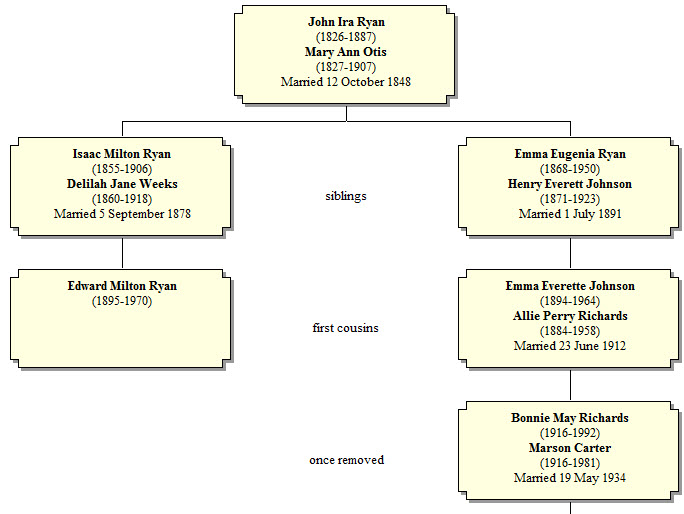
RootsMagic Relationship Chart Sample, Debbie Parker Wayne
To cite this blog post: Debbie Parker Wayne, "Wanted: Genetic Genealogy Analysis Tools Incorporating Family Tree Charts," Deb's Delvings, 21 March 2017 (http://debsdelvings.blogspot.com/ : accessed [date]).
© 2017, Debbie Parker Wayne, Certified Genealogist®, All Rights Reserved
