Showing posts with label Genetic Genealogy Tools and Charts. Show all posts

20 May 2019

Genetic Genealogy Abbreviations and Terms Quick Reference

Now available, Practical Genetic Genealogy Abbreviations and Terms Quick Reference laminated guide.

I was asked to compile a laminated quick reference guide for DNA and genetic genealogy abbreviations and terminology. Even though the ISOGG Wiki and other online sources contain much of this information, it seems many people prefer to have the information available in a laminated guide.


This quick reference guide has several advantages over online access.
  1. The definitions needed by genealogical researchers are in one easy-to-access place.
  2. Both beginner and intermediate level terms are included.
  3. These are clearly-worded definitions that are easy for non-biologists to understand. I often receive praise for being able to explain DNA in a way that is easy to understand and I tried to continue that tradition here.
  4. An image of my gingerbread men used to explain DNA inheritance patterns is included. I am constantly asked to provide color versions of this image to students. The image has two couples on the top row, a male and female child of the couples on the middle row, and four grandchildren on the bottom row. A "Y" represents the inheritance path of the Y chromosome through the family. An "O" represents the inheritance path of the mitochondrial DNA through the family. The left half of the gingerbread bodies represent one autosomal chromosome (for example, chromosome one) inherited from the father. The right half of the gingerbread bodies represent the corresponding autosomal chromosome inherited from the mother. The colors of the autosomal DNA represent randomly recombined chromosomes and the colors can be traced back to the great-grandparents not shown on the chart. The colors make it easy to see fully identical regions (FIR) and half identical regions (HIR) of DNA shared by the siblings in the bottom row.

The quick reference sheet is currently available from Books and Things (http://www.mygenealogybooks.com/) priced with shipping included.


All statements made in this blog are the opinion of the post author. This blog is not sponsored by any entity other than Debbie Parker Wayne nor is it supported through free or reduced price access to items discussed unless so indicated in the blog post. Hot links to other sites are provided as a courtesy to the reader and are not an endorsement of the other entities except as clearly stated in the narrative.


To cite this blog post:
Debbie Parker Wayne, "Genetic Genealogy Abbreviations and Terms Quick Reference," Deb's Delvings, 20 May 2019 (http://debsdelvings.blogspot.com/ : accessed [date]).

© 2019, Debbie Parker Wayne, Certified Genealogist®, All Rights Reserved

21 July 2018

Learning DNA and Getting Help with Analysis Tools

More people are jumping into DNA testing and genetic genealogy who are not experienced in DNA or genealogy before taking that first DNA test. Joining a social media group or a mail list or forum provides exposure to many programs and tools, terms, and techniques that make it seem like a fire hose is aimed at you at full blast.

It is great to jump in. It is great to ask questions to learn. But you never know how much the person answering you knows. And they may not even know they are giving you information that is not completely accurate because they misunderstood your question.

Below are some places to (1) learn more about DNA and (2) get better help when one of the DNA tools does not work as you expected.

To learn the basics of DNA you can

Start small when learning something new and build up to higher levels. This applies to studying DNA using the recommendations above and to learning new tools.


When learning a new tool or process test first with a small dataset. For example, when I first downloaded the version of Progeny Charting Companion that creates DNA analysis charts, I created a small RootsMagic database with only four DNA test takers and the direct lines back to their shared ancestors (as shown in the chart above). I created a dummy CSV file with the minimum amount of data needed for those test takers' DNA data (as defined in the Charting Companion's help files). I used this small dataset to play with the charts offered by Charting Companion until I understood how the options worked to get the output I desired. Once I was comfortable using the tool I then accessed my full RootsMagic database after adding the new facts needed for DNA charts to work properly (like DNA kit numbers for each test taker).


After you begin using a new tool, it may not always work as expected and you may need help. To get better help when one of the DNA analysis tools does not work as expected (most of this applies to any program or app)
  • read the instructions (built-in help files, a user's guide, how-to instructions on the program's website)
  • really read the instructions—do not just scan them—and be sure you followed every step carefully, including the steps that are linked into or referenced from the first help page you access (most problems are due to not following instructions; trust me on this, I worked tech support and trained computer users for much of my "life before genealogy")
  • if you followed the instructions carefully and still have problems, make note of any error messages displayed (or failure mode) and step-by-step what you did just before the failure or error
  • use Google or another engine to search for the error message or failure mode (if the program uses Facebook to offer technical support, use Facebook's "Search this group" feature)
  • if potential solutions are found try them
  • if no solution is found by searching or the solutions found do not work for you, then post a message asking for help; include
    • the tool name and version of the tool you are using (also indicate if you recently updated the tool)
    • the error message received or exactly what you saw that was not "right"
    • the step-by-step list of what was done before the error message was received or the program failed
    • whether you are using a Windows, Mac, Android, iOS, or other device and the version of that operating system
    • whether this is something that worked in the past or this is your first time to try this procedure

These recommendations should help you get better technical support and help you learn new programs and DNA analysis more productively.

Update 23 July 2018: Fixed minor typo, added NGS online training courses, and added to disclaimer royalties for courses and books.


All statements made in this blog are the opinion of the post author. This blog is not sponsored by any entity other than Debbie Parker Wayne nor is it supported through free or reduced price access to items discussed unless so indicated in the blog post. Hot links to other sites are provided as a courtesy to the reader and are not an endorsement of the other entities except as clearly stated in the narrative.

Debbie Parker Wayne receives royalties for the NGS course she authored on autosomal DNA analysis and books for which she is an author or editor.


To cite this blog post:
Debbie Parker Wayne, "Learning DNA and Getting Help with Analysis Tools," Deb's Delvings, 21 July 2018 (http://debsdelvings.blogspot.com/ : accessed [date]).

© 2018, Debbie Parker Wayne, Certified Genealogist®, All Rights Reserved

15 May 2018

Whole Genome Sequence (Part 2) - Analysis Tools

For earlier parts see
Whole Genome Sequence (Part 1) — YSEQ.net options and files received

I am investigating bioinformatics1 tools to analyze Whole Genome Sequence (WGS) data. I have access to a WGS for someone who has also tested at several genealogy testing companies. I want to do some comparisons between the raw data from the genealogy testing companies and the WGS, checking for accuracy of the reads. To satisfy my curiosity, I plan to investigate some of the medical implications and traits discussed in scientific papers.

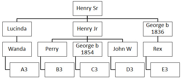
Once I have multiple WGSs from relatives, I plan to do some comparisons as to whether segments that the testing companies indicate match really do match completely with the higher resolution data. I am interested in how closely the statistical predictions on linkage disequilibrium and crossovers mirror what is seen in real family multi-generational studies. For example, in the shared segments marked below, not every SNP is tested. A number of SNPs in a segment are tested and we assume the non-tested SNPs match based on statistical predictions.


My previous career in software development, testing, and support made me familiar with Open-Source Software so I look for available tools before spending time writing my own. Tools I am checking out include Samtools, National Center for Biotechnology Information's (NCBI) Genome Workbench, and Broad Institute's Integrative Genome Viewer (IGV).

This new BioRxiv paper is timely for my quest:

"A large-scale analysis of bioinformatics code on GitHub," by Pamela H Russell, Rachel L Johnson, Shreyas Ananthan, Benjamin Harnke, and Nichole E Carlson, doi: https://doi.org/10.1101/321919. The meaty data is in the supplemental material which consists of several large files (some over 200MB) linked from the article abstract.

By the way, just as with some of the best genealogy articles, the reference notes in this article led me to several additional sources I now need to consult.

As a woman, this sentence is especially depressing: "... the proportion of female contributors decreases for high-profile repositories and with seniority level in author lists".2 I hope this changes and more women participate in bioinformatics.


geralt, Pixabay (https://pixabay.com/en/learn-mathematics-child-girl-2405206/ : accessed 15 May 2018), CC0 Creative Commons.

I am impressed with how many databases and tools are out there for DNA analysis. I did not realize there are over 1,700 bioinformatics repositories and "23 'high profile' GitHub repositories containing source code for popular and highly respected bioinformatic tools."3 "Our analysis points to simple recommendations for selecting bioinformatic tools from among the thousands available."4 Some of these will not be useful for genealogy, but some will.

One tool aimed at the genetic genealogy community is Thomas Krahn's tool for annotating a BigY VCF file and identifying derived and novel SNPs.5 Thomas kindly shared this tool so others can do the analysis instead of having it done by his company YSEQ.net.

Some of the discussions in the scientific world parallel those we are having in the genealogy world.

"In recent years, the explosion of genomic data and bioinformatic tools has been accompanied by a growing conversation around reproducibility of results and usability of software. Reproducibility requires that authors publish original data and a clear protocol to allow repetition of the analysis in a paper."6 In the genealogy world we are discussing publicly available DNA data, such as on GEDmatch.com, allowing DNA analysis to be reproduced and referenced from a publication.


OpenClipart-Vectors, Pixabay (https://pixabay.com/en/analysis-biology-biotechnology-2025786/ : accessed 15 May 2018), CC0 Creative Commons.

"The bioinformatics field embraces a culture of sharing — for both data and source code — that supports rapid scientific and technical progress."7 In the genealogy world we are discussing privacy issues versus sharing data, especially with the recent proliferation of stories on law enforcement use of genealogy databases.

I have been musing on whether to learn Python or Ruby. A recent discussion with a young programmer had me leaning towards Python. Since the "greatest amount of code in the main dataset was in Javascript, followed by Java, Python, C++, and C"8 maybe I will stay with Javascipt and Java, which I already know, if I develop any new tools for web usage. I have a few tools I wrote in Perl for my own use that I hope to clean up and share eventually.

In addition to DNA adding to my knowledge of my family tree, it is forcing me to upgrade my data analysis knowledge and computer tools familiarity. I hope all of this study helps keep my mind active and reduces those "senior moments" that seem to occur more frequently with the years.


1. The science of collecting and analyzing complex biological data such as genetic code.
2. Pamela H Russell, et al., "A large-scale analysis of bioinformatics code on GitHub," 15 May 2018, BioRxiv pre-publication, https://doi.org/10.1101/321919, line 35.
3. Ibid., line 27.
4. Ibid., line 148.
5. Thomas Krahn, "bigY_hg39_pipeline.sh," GitHubGist (https://gist.github.com/tkrahn/283462028c61cd213399ba7f6b773893).
6. Russell, "A large-scale analysis of bioinformatics code on GitHub," line 84.
7. Ibid., line 120.
8. Ibid., line 208.


All statements made in this blog are the opinion of the post author. This blog is not sponsored by any entity other than Debbie Parker Wayne nor is it supported through free or reduced price access to items discussed unless so indicated in the blog post. Hot links to other sites are provided as a courtesy to the reader and are not an endorsement of the other entities except as clearly stated in the narrative.


To cite this blog post:
Debbie Parker Wayne, "Whole Genome Sequence (Part 2) - Analysis Tools," Deb's Delvings, 15 May 2018 (http://debsdelvings.blogspot.com/ : accessed [date]).

© 2018, Debbie Parker Wayne, Certified Genealogist®, All Rights Reserved

05 January 2018

A Different X-DNA Inheritance Chart (by John Motzi)

John Motzi has developed an Excel X-DNA Inheritance Chart that includes only the ancestors who may have contributed to the X chromosome of a person. I have made this chart available on my website with John's permission.

The Excel file can be accessed directly at http://debbiewayne.com/presentations/dna/MotziJohn_Xinheritance_Ancestry_Chart.xlsx. There is also a link available from my QuickRef Links section at http://debbiewayne.com/pubs.php#quickref once you scroll down to the section with links to "Charts for X-DNA analysis by others." You can find John's email address there also if you wish to contact him about the chart.

Because the names of ancestors who could not have contributed to the X chromosome are eliminated, this may make more sense to some of us and make it easier to find common ancestors on the X lines. While my versions of the charts make sense to me, some of you may prefer John's version of the charts or the ones created by others that are also linked in my Quickref section.

All of us think a little differently and the same tool is not best for all. Try this out and see if it works better for you.


All statements made in this blog are the opinion of the post author. This blog is not sponsored by any entity other than Debbie Parker Wayne nor is it supported through free or reduced price access to items discussed unless so indicated in the blog post. Hot links to other sites are provided as a courtesy to the reader and are not an endorsement of the other entities except as clearly stated in the narrative.


To cite this blog post:
Debbie Parker Wayne, "A Different X-DNA Inheritance Chart," Deb's Delvings, 4 January 2018 (http://debsdelvings.blogspot.com/ : accessed [date]).

© 2018, Debbie Parker Wayne, Certified Genealogist®, All Rights Reserved

09 October 2017

DNA Analysis: Random is Most Important Factor

Correctly analyzing DNA matches for genetic genealogy is much harder than most researchers may think.

What is the most important thing to remember when interpreting DNA matches to determine relationships?


CC0 License, Debbie Parker Wayne, Random DNA Word Cloud

Researchers must remember that random recombination and mutations make it impossible to predict exactly how much DNA, if any, will be shared by two people, in general. The charts giving shared percentages of 50%, 25%, 12.5%, and so on are based on statistical probabilities. Real life seldom ever exactly matches a statistical probability. One exception is that each person does inherit one-half of the autosomal DNA from each parent.

Any reader of a mail list, forum, or Facebook will constantly see questions such as, "I share XYZ% of DNA with personXYZ. What relationship do we share?" And that reader will see tons of responses such as, "You must be XYZ relationship." The more savvy researchers will indicate there are several likely relationships and point to charts such as The Shared cM Project.1 There are also some tools, such as the matrices on GEDmatch.com and the relationship predictions made by the testing companies, that use the statistical shared percentages to predict relationships.

Researchers must remember to use these predictions only as clues and not as a hard-and-fast limit to accurately analyze DNA findings.

The first chart below uses GEDmatch matrix tools to demonstrate how even full siblings can share widely varying amounts of DNA with a DNA match. Four full siblings are compared to a known fourth cousin. One sibling shares only 12.4 cM of atDNA, one shares 19.8 cM, one shares 50.2 cM, and one shares 52.1 cM. The second chart shows that the GEDmatch generations matrix tool predicting the number of generations between the test-takers varies from 4 to over 7. (GEDmatch changes the order of the siblings in the different matrix views.)


© 2017, Debbie Parker Wayne,
GEDmatch Shared atDNA Matrix, Siblings to 4C

>
© 2017, Debbie Parker Wayne,
GEDmatch Generations Matrix, Siblings to 4C

Blaine published "The Shared cM Project" data using a Creative Commons License which gives permission for others to use and adapt the data as long as the adaptation is also made freely available and follows a few other restrictions.

Jonny Perl at DNA Painter adapted the data to create a Shared cM Project tool that highlights relationships that have been shown to share a specified amount of DNA. There are some differences in the highlighted relationships for 12.4 and 52.1 shared cM as shown in the images below.


CC0 License, Jonny Perl,
DNA Painter Shared cM Project Tool, Heading


CC0 License, Jonny Perl,
DNA Painter Shared cM Project Tool, 52.1 shared cM


CC0 License, Jonny Perl,
DNA Painter Shared cM Project Tool, 12.4 shared cM

The moral of the story is, as the Genetic Genealogy Standards indicate, there may be more than one way to interpret DNA test results:
19. Interpretation of DNA Test Results. Genealogists understand that there is frequently more than one possible interpretation of DNA test results. Sometimes, but not always, these possible explanations can be narrowed by additional testing and/or documentary genealogical research. Genealogists further understand that any analysis of DNA test results is necessarily dependent upon other information, including information from the tester, and that the analysis is only as reliable as the information upon which it is based.2


1. Blaine T. Bettinger, "The Shared cM Project," The Genetic Genealogist (https://thegeneticgenealogist.com/). Search the blog posts for the most recent update to the project.
2. Genetic Genealogy Standards Committee, Genetic Genealogy Standards(http://www.geneticgenealogystandards.com/).


To cite this blog post: Debbie Parker Wayne, "DNA Analysis: Random is Most Important Factor," Deb's Delvings, 9 October 2017 (http://debsdelvings.blogspot.com/ : accessed [date]).

© 2017, Debbie Parker Wayne, Certified Genealogist®, All Rights Reserved

30 June 2017

One DNA Analysis Chart Process

Edited 13 July 2017 to add MS Word Smart Art tip from David Williams.

I presented a webinar last month on correlating DNA and documentary evidence using the Genealogical Proof Standard (GPS). The webinar was sponsored by BCG and presented by Legacy Family Tree Webinars.

Several viewers contacted me asking how I created the charts I used in the webinar.

Over the last few years I have tried multiple methods. I wrote about some different methods I have used and asked researchers to send me your feature wish list back in March ("Wanted: Genetic Genealogy Analysis Tools Incorporating Family Tree Charts"). I am still collecting ideas for all types of features genetic genealogists would like added to software programs to assist in DNA analysis. Please email your wish list to debbieparkerwayne at gmail dot com or add a comment to this blog post or the "Wanted ..." blog post.

The family tree charts in the webinar were made with Smart Art in Microsoft (MS) Word where I customized the colors and effects on the boxes. A template for the charts is online at http://debbiewayne.com/presentations/dna/MSWord_smartart_chart_black.docx.

I sometimes use TreeDraw (http://treedraw.spansoft.org/), Progeny Charting Companion (https://progenygenealogy.com/products/family-tree-charts.aspx), and RootsMagic, as well as Microsoft Smart Art to create the charts. Lucid Chart (https://www.lucidchart.com/) is used by some of my colleagues. It has some features you have to pay to access and it is a web-based tool.

Until one of the genealogy or charting programs or third-party utilities automates the process I have settled on the following procedure to create my charts for DNA analysis.

  1. I create a descendant chart (using one of the tools named above) with only the lineages of the DNA test-takers under analysis. When using MS Smart Art I add one extra block at the bottom of each line because, for some silly reason, Word offsets the last block.

    Tip from David Williams added 13 July 2017: Instead of adding an extra block, click on the "Design" ribbon, click on the parent block for the offset block, click on "Layout" in the "Create Graphic" section of the ribbon, select "Standard." This relocates the last block in a straight line with the others. Thanks, David, for sharing this Word tip.

    I found you can also use control/click to select all of the parent blocks before clicking "Layout> Standard" and fix all lines at one time. Also, if you do not see the "Layout" drop-down menu in the "Create Graphics" section of the ribbon, it may be because Word replaces the words with icons when the window is too narrow to display all of the words spelled out. Make your Word window wider or move your mouse over the image of a chart in the "Create Graphics" section and then you should see a popup indicating this is the link to "Organizational Chart Layout." The template has been modified to fix this layout issue. There is no need to add an additional block any longer.


  2. Once I have the chart I want, I grab a screen-shot and save it as an image. I use Snagit by TechSmith, but there are other options including built-in operating system snipping tools.

  3. I then insert that chart image into my image editor (I use Snagit editor) (where I used to remove that offset block, but no longer need to now). I may also fill in background colors or make other changes to the image, sometimes coloring in the block for my focus person.

  4. I insert the modified image into a Word document and enlarge it to fill the page leaving a margin on both left and right.

  5. I create a MS Word table under the image. The table has two columns more than the number of lines in my descendant chart. I then either manually size each table column or use the table properties to have Word automatically size the columns so that each table column lines up under a family line in my chart. The two extra columns are to the left and right. I insert the names of the test-takers into the left column, right column, and the top row of the table so I have a matrix to indicate how all of the test-takers compare to each other.

  6. The document can be printed to allow penciling in of relationships and total amount of shared atDNA,
    atDNA chromosome match segment data (chromosome number, start, end, length in cM),
    Y-DNA STR values,
    or whatever is being analyzed.

  7. Once I am satisfied with my numbers then I enter them into the table in Word and save the document.

For detailed analysis, I use the full chromosome segment start and end values as given by the testing company. In the webinar and the images above I shortened the numbers by using K to represent thousands and M to represent millions. This is to allow more data to fit onto the image for a Powerpoint slide.

The process is more complex to describe than it is to do.

Some genealogists like Excel charting. If you do, you might be interested in the McGuire charting method. See http://thegeneticgenealogist.com/2017/03/19/guest-post-the-mcguire-method-simplified-visual-dna-comparisons/. I find Excel's drawing tools more difficult to use than Word, and even Word is not intuitive or easy.

There are many online help sites with info on how to use Microsoft Smart Art. When I want to do something new I usually just try Google and can generally find step-by-step instructions.


To cite this blog post:
Debbie Parker Wayne, "One DNA Analysis Chart Process," Deb's Delvings, 30 June 2017, updated 13 July 2017 (http://debsdelvings.blogspot.com/ : accessed [date]).

© 2017, Debbie Parker Wayne, Certified Genealogist®, All Rights Reserved

01 April 2017

AncestryDNA Genetic Communities

Note: All images are screenshots captured by Debbie Parker Wayne. Where names of living people are include, permission was obtained.

Be aware: Genetic Communities is clearly marked as a "beta" resource. It will change over time and changes have already been seen in the community makeup, names, and assignments since the rollout.

This week AncestryDNA unveiled a new tool for DNA test-takers—Genetic Communities. This tool may clear up some of the widespread misunderstanding of admixture prediction. Admixture predictions are based on where our ancestors may have been thousands of years ago—a period for which few genealogists have documentary evidence. Genetic communities are where our ancestors were within two hundred years (more or less)—a period for which most genealogists have documentary evidence.

Quick! Take advantage of the chance to learn about Genetic Communities for free through until 6 April 2017 by viewing this informative webinar recording. There is a fee to view after that date.

Blaine T. Bettinger, "Exploring AncestryDNA's New Genetic Communities," webinars, Legacy Family Tree (http://familytreewebinars.com/download.php?webinar_id=618).

On March 20th on Facebook Blaine asked each of us to predict what our Genetic Communities (GC) would be. My prediction was Upper South and Lower South:


This prediction is based on the birth states of my ancestors shown in the chart below. A Facebook friend started a meme a year or so ago. He had us creating four to six generation pedigree charts listing only the birthplaces of ancestors and color-coding the blocks. Here is the chart I posted last year (I have filled in a few of the question marks since then with ancestor names). It shows all of my ancestors born in the South back to the early 1800s. Earlier generations are not shown here, but they are in the southern United States as far back as I have traced each line. I have one lone fourth-great-grandfather who was supposedly born in New York in about 1800 and was in Mississippi by 1810 to 1820.


My GCs are exactly what I predicted. The names assigned by Ancestry are not Upper South and Lower South. The expected Southern states are included in the GCs which have been given more descriptive names by AncestryDNA.


So how do these GCs help me with my genealogical research? For me, I get few new clues as to locations of ancestors after the late 1700s. Someone with a less extensive tree may get clues as to which states their ancestors came from.

Clicking the Connections button, I do get some clues as to potential European origins of most settlers in the areas where my ancestors settled in the New World. These clues agree with the family stories that have been passed down of ancestral origins in Germany, England, Scotland, and Ireland.


I see a list of surnames that are found more often in this GC than outside of it. I can use the "View All Matches" button to see which of my DNA matches are also part of this GC.


This match list contains only DNA matches who are also part of this GC. A match with a shallow tree may be able to get some clues from the ancestors in my tree that are in this GC.


Back on the window with the GC Stories, if I click on one Year Span in the community story bar I can see which of my ancestors were in this community during that time span. I can use the left and right arrow keys next to the year span to cycle through all year spans.


I can zoom the map in to see finer detail. I can click on a "pin" on the map to see which ancestors are associated with this pin.


As of now, all of my ancestor pins only narrow the locale down to a region of a state. This may be because my tree on Ancestry does not include county level details for all events. However, if Ancestry plans to extend this GC tool to show us our ancestors and ancestors of our matches in the same or nearby counties, I may be tempted to share more of the details in my tree on Ancestry. (I never had a tree on Ancestry.com until I took a DNA test with them and wanted to use some of the DNA tools that require a public tree. I only took the time to enter a barebones tree with ancestors; no collaterals; basic birth, marriage, death info; and states only for some locations. At least once RootsMagic can sync with Ancestry it will be easier to update an Ancestry tree if I decide to place all of my data online.)

It is helpful to see which of my ancestral lines were in the same or nearby counties at the same time. This is a great by-product of the GC maps. Before now, I had to use other tools to map where my ancestors were at any given time.

For details on the science behind Genetic Communities and how others have used GCs see these resources.

The scientific paper:
Eunjung Han, et al., "Clustering of 770,000 genomes reveals post-colonial population structure of North America," Nature Communications 8, Article number: 14238 (2017) doi:10.1038/ncomms14238 (http://www.nature.com/articles/ncomms14238).

The Ancestry white paper:
Catherine A. Ball, et al., "Genetic Communities™ White Paper: Predicting fine-scale ancestral origins from the genetic sharing patterns among millions of individuals," Ancestry (https://www.ancestry.com/cs/dna-help/communities/whitepaper).

Blaine Bettinger, "AncestryDNA’s Genetic Communities are Finally Here!," The Genetic Genealogist, 28 March 2017 (http://thegeneticgenealogist.com/2017/03/28/ancestrydnas-genetic-communities-are-finally-here/).

Leah LaPerle Larkin, "Genetic Communities Are Here!," The DNA Geek, 27 March 2017 (http://thednageek.com/genetic-communities-are-here/).

Leah LaPerle Larkin, "The Science Behind Genetic Communities at AncestryDNA," The DNA Geek, 3 March 2017 (http://thednageek.com/the-science-behind-genetic-communities-at-ancestrydna/).

Roberta Estes, "More About Genetic Communities and Display Problem Hints," DNAeXplained – Genetic Genealogy blog, 28 March 2017 (https://dna-explained.com/2017/03/28/more-about-genetic-communities-and-display-problem-hints/).


To cite this blog post: Debbie Parker Wayne, "AncestryDNA Genetic Communities," Deb's Delvings, 1 April 2017 (http://debsdelvings.blogspot.com/ : accessed [date]).

© 2017, Debbie Parker Wayne, Certified Genealogist®, All Rights Reserved

21 March 2017

Wanted: Genetic Genealogy Analysis Tools Incorporating Family Tree Charts

Programmers who are interested in genetic genealogy have provided some great tools for DNA analysis. Testing companies provide some great tools, too. New tools are produced all of the time and I use and love most of them. I WANT MORE. I want some specific features. Few of these tools today correlate the detailed DNA data (Y-DNA STR mutations, atDNA shared segments with start and stop points on a chromosome) with the family tree in an easily understood way. That correlation is essential for the "genealogy" in genetic genealogy.

One of the to-do tasks that keeps getting shoved lower on my priority list is to provide genealogy software developers with a list of what we need to incorporate DNA data into our databases and to create useful output for analysis. Genetic genealogical research has matured to the point where this should become a priority.

If we all pool our ideas, we can come up with a good list to provide to developers so the output is what we want. We need a list of the data we want to store in the genealogy database as well as what type of output reports we need.

So what would your ideal genealogy database incorporate and provide as output for your genetic analysis? Not necessarily the raw DNA data for analysis, but the shared DNA data related to the other test-takers in your database.

Feel free to provide suggestions as comments to this blog post, as Facebook comments if you read this on Facebook, or contact me directly using the email addresses on my website http://debbiewayne.com/ (scroll to the bottom of any page to see contact info).

So what finally spurred me to make this a priority after all this time? (1) I investigated different tree creation tools a few months ago and discussed it on Facebook. I found none of the tools produce exactly what I want for DNA analysis. (2) The McGuire Method of charting several of us saw last summer was published.


Lauren McGuire recently wrote a guest post on Blaine T. Bettinger's The Genetic Genealogist blog, "GUEST POST: The McGuire Method – Simplified Visual DNA Comparisons." This describes the great chart she designed for correlating a family tree and shared autosomal DNA (atDNA) totals for analysis. The chart Lauren uses in the blog post displays total shared centimorgans (cM), percentage shared, and relationship of each person on the tree in an efficient and compact format. I like seeing all of these items at once as all are important during analysis.

I immediately loved Lauren's chart when I first saw it. She and I obviously think the same way about what we want to see when analyzing DNA information.

My own charts started out with printed trees - either created in an image editor, Microsoft Word SmartArt, RootsMagic genealogy software, Progeny Charting Companion, or, more recently TreeDraw. Lauren and many others use Excel. Some use LucidChart and other online charting tools (find more info on these tools with a Google search). None of these tools provide an easy way to create a tree that only includes the DNA test-takers, much less incorporate the DNA data with the tree. And often my DNA data is handwritten at the bottom of the printed chart. If I want to make it look prettier then I spend a lot of time getting a Word table to line up under the family tree.

My own charts have evolved over the years. I started by creating an image of the tree and Y-DNA STR differences in an image editor:

Y-DNA and Tree Chart as Image, Debbie Parker Wayne

That evolved into a Word table that was easier to modify:


Y-DNA and Tree Chart as Table, Debbie Parker Wayne

Then into Word SmartArt which was better to show in a presentation:

Y-DNA and Tree Chart as Smart Art, Debbie Parker Wayne

For autosomal DNA triangulation I started with Word SmartArt and hand-written shared segment info:


atDNA and Tree Chart as Smart Art with Hand-written Notes, Debbie Parker Wayne

That evolved into simplified trees with a Word table showing shared segment info:


atDNA and Tree Chart as Smart Art with Shared Segment Table, Debbie Parker Wayne

I use a similar table when I am analyzing total shared DNA against the tree relationships.

What other formats have you found useful? What would make your DNA analysis process easier?

In my opinion, tree charts are most useful when each test-taker's lineage is shown in a column and each generation is contained in a row. The DNA data for a test-taker can be shown below in the same column as the lineage. The rows allow for easy calculation of relationships - which the software could do for us and include in the chart.

A chart including only the people in the DNA study is essential. I have been creating additional RootsMagic databases including only the DNA test-takers and their ancestors, but this takes a lot of time. The pared down database is input to one of the charting programs, but I still sometimes have to remove spouse boxes when I am only interested in the men for a Y-DNA study, for example. Creating a chart from my full database and then deleting the people I do not want takes even longer.

The DNA data to incorporate into our genealogy database varies for Y-DNA, autosomal and X-DNA, and mitochondrial DNA. Autosomal DNA analysis requires total shared DNA or shared segment information. Y-DNA analysis requires notation of differing Y-DNA STR and SNP markers. Mitochondrial DNA requires listing the locations that differ from a reference sequence and/or between test-takers. For Y-DNA and mtDNA we may want to include haplogroups. Even though we all know the admixture estimates vary depending on the reference population and algorithm used, we might want to record the estimates and which portions of which chromosomes match which reference populations.

Send me your ideas and I will compile a list we can prioritize and provide to the genealogy software developers. This new list will not be specific to any testing company or software, but a list of data we want to track in our DNA analysis and provide in reports we use for our analysis and publications. There may some overlap between the list I compile and the ISOGG Wiki wish lists for the testing companies:
https://isogg.org/wiki/FTDNA_wish_list,
https://isogg.org/wiki/23andMe_wish_list,
https://isogg.org/wiki/AncestryDNA_wish_list, and
https://isogg.org/wiki/MyHeritage_wish_list.

If you are on Facebook, these discussions relate to this issue although you may not be able to see the posts depending on Facebook settings
https://www.facebook.com/debbie.p.wayne/posts/10212404574018709
https://www.facebook.com/groups/DNADetectives/permalink/1389234674480979/


March 21: Added a cropped portion of the McGuire chart with permission of creator, Lauren McGuire.

March 22: Image added to illustrate reply below to nut4nature22 dated March, 2017 05:43:

RootsMagic Relationship Chart Sample, Debbie Parker Wayne


To cite this blog post: Debbie Parker Wayne, "Wanted: Genetic Genealogy Analysis Tools Incorporating Family Tree Charts," Deb's Delvings, 21 March 2017 (http://debsdelvings.blogspot.com/ : accessed [date]).

© 2017, Debbie Parker Wayne, Certified Genealogist®, All Rights Reserved

20 March 2017

Different View of Shared cM Project Data

A while ago Blaine T. Bettinger gathered data (and is still collecting more data) for the Shared cM Project which he published. His charts fit on one page and shows the estimated average, and more importantly, actual minimum and maximum amount of shared cM reported between two test-takers with a known relationships.

I love Blaine's chart because all of the data fits on one page, but for visual learners the overlap in the minimum and maximum numbers is easier to see in a bar chart format. Since Blaine published his data under a Creative Commons "CC 4.0 Attribution License" others can adapt the data and publish changes under the same license.

So I reformatted Blaine's data in a bar chart format. One complete chart is available which should be printed on 11x17 paper in landscape format to be easily readable. The chart is also split into four parts with some overlapping relationships to allow the data to be printed in a more readable format in four pieces. To me, this is easier to show someone so they can see that sharing, for example, 100 cM, could fall into any of nine relationships shown on the chart. And the chart does not even include all of the potential double, half, and removed possibilities for cousins. I hope these are as useful for other researchers as they are for me.


Click the links below to access full size images.


To cite this blog post:
Debbie Parker Wayne, "Different View of Shared cM Project Data," Deb's Delvings, 20 March 2017 (http://debsdelvings.blogspot.com/ : accessed [date]).

© 2017, Debbie Parker Wayne, Certified Genealogist®, All Rights Reserved