I presented a webinar last month on correlating DNA and documentary evidence using the Genealogical Proof Standard (GPS). The webinar was sponsored by BCG and presented by Legacy Family Tree Webinars.
Several viewers contacted me asking how I created the charts I used in the webinar.
Over the last few years I have tried multiple methods. I wrote about some different methods I have used and asked researchers to send me your feature wish list back in March ("Wanted: Genetic Genealogy Analysis Tools Incorporating Family Tree Charts"). I am still collecting ideas for all types of features genetic genealogists would like added to software programs to assist in DNA analysis. Please email your wish list to debbieparkerwayne at gmail dot com or add a comment to this blog post or the "Wanted ..." blog post.
The family tree charts in the webinar were made with Smart Art in Microsoft (MS) Word where I customized the colors and effects on the boxes. A template for the charts is online at http://debbiewayne.com/presentations/dna/MSWord_smartart_chart_black.docx.
I sometimes use TreeDraw (http://treedraw.spansoft.org/), Progeny Charting Companion (https://progenygenealogy.com/products/family-tree-charts.aspx), and RootsMagic, as well as Microsoft Smart Art to create the charts. Lucid Chart (https://www.lucidchart.com/) is used by some of my colleagues. It has some features you have to pay to access and it is a web-based tool.
Until one of the genealogy or charting programs or third-party utilities automates the process I have settled on the following procedure to create my charts for DNA analysis.
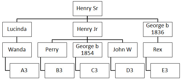
- I create a descendant chart (using one of the tools named above) with only the lineages of the DNA test-takers under analysis. When using MS Smart Art I add one extra block at the bottom of each line because, for some silly reason, Word offsets the last block.
Tip from David Williams added 13 July 2017: Instead of adding an extra block, click on the "Design" ribbon, click on the parent block for the offset block, click on "Layout" in the "Create Graphic" section of the ribbon, select "Standard." This relocates the last block in a straight line with the others. Thanks, David, for sharing this Word tip.
I found you can also use control/click to select all of the parent blocks before clicking "Layout> Standard" and fix all lines at one time. Also, if you do not see the "Layout" drop-down menu in the "Create Graphics" section of the ribbon, it may be because Word replaces the words with icons when the window is too narrow to display all of the words spelled out. Make your Word window wider or move your mouse over the image of a chart in the "Create Graphics" section and then you should see a popup indicating this is the link to "Organizational Chart Layout." The template has been modified to fix this layout issue. There is no need to add an additional block any longer.

- Once I have the chart I want, I grab a screen-shot and save it as an image. I use Snagit by TechSmith, but there are other options including built-in operating system snipping tools.
- I then insert that chart image into my image editor (I use Snagit editor) (where I used to remove that offset block, but no longer need to now). I may also fill in background colors or make other changes to the image, sometimes coloring in the block for my focus person.

- I insert the modified image into a Word document and enlarge it to fill the page leaving a margin on both left and right.
- I create a MS Word table under the image. The table has two columns more than the number of lines in my descendant chart. I then either manually size each table column or use the table properties to have Word automatically size the columns so that each table column lines up under a family line in my chart. The two extra columns are to the left and right. I insert the names of the test-takers into the left column, right column, and the top row of the table so I have a matrix to indicate how all of the test-takers compare to each other.

- The document can be printed to allow penciling in of relationships and total amount of shared atDNA,
atDNA chromosome match segment data (chromosome number, start, end, length in cM),
Y-DNA STR values,
or whatever is being analyzed.
- Once I am satisfied with my numbers then I enter them into the table in Word and save the document.


For detailed analysis, I use the full chromosome segment start and end values as given by the testing company. In the webinar and the images above I shortened the numbers by using K to represent thousands and M to represent millions. This is to allow more data to fit onto the image for a Powerpoint slide.
The process is more complex to describe than it is to do.
Some genealogists like Excel charting. If you do, you might be interested in the McGuire charting method. See http://thegeneticgenealogist.com/2017/03/19/guest-post-the-mcguire-method-simplified-visual-dna-comparisons/. I find Excel's drawing tools more difficult to use than Word, and even Word is not intuitive or easy.
There are many online help sites with info on how to use Microsoft Smart Art. When I want to do something new I usually just try Google and can generally find step-by-step instructions.
To cite this blog post:
Debbie Parker Wayne, "One DNA Analysis Chart Process," Deb's Delvings, 30 June 2017, updated 13 July 2017 (http://debsdelvings.blogspot.com/ : accessed [date]).
© 2017, Debbie Parker Wayne, Certified Genealogist®, All Rights Reserved